
AI-Powered/Dynamic Branding: How to Build a Brand That Adapts in Real Time (A Practical Guide)
For decades, a brand was a fixed thing: one logo, one color palette, one PDF of guidelines that lived in a shared drive and got opened maybe twice a year. That model is breaking down. In 2026, the strongest brands treat their identity less like a static document and more like a living system, one that senses context and adjusts itself accordingly, while still staying recognizably itself.
That's what "AI-powered" or "dynamic" branding actually means: not a gimmick where a logo wiggles on a screen, but a structured system where a defined set of brand elements can shift, color, tone, motion, even iconography, based on platform, audience, campaign, or region, without breaking the underlying identity. This article breaks down how that system actually works, walks through a concrete example, and gives you a step-by-step way to start building one, whether you're a solo founder or running a small agency.
Static branding vs. dynamic branding
The shift becomes clearest when you line the two approaches up against each other. Static branding runs on a fixed PDF of guidelines that gets updated rarely, a single logo file used everywhere regardless of context, fixed hex codes for every color, one tone applied uniformly across every channel, assets designed once by a person and left alone, and an update cycle that only really happens during an occasional full rebrand. Dynamic branding replaces each of those with something more responsive: a living system that updates across platforms in real time, a core mark paired with a rule-based system of variants, anchor colors that adjust based on platform, mode, or context, one set of tone pillars expressed differently depending on audience or region, assets that are designed once by a person and then extended and varied using AI tools, and continuous, small adjustments driven by real feedback rather than a once-a-year overhaul.
The key distinction most people miss: dynamic branding is not "no rules." It's more rules, just applied more flexibly. The rules move from "always use this exact file" to "always follow this logic, and let the system generate the right output for the moment."
The four layers of a dynamic brand system
Think of dynamic branding as four stacked layers, each doing a different job.
1. The identity core (fixed, never changes). This is your non-negotiable brand DNA: your core wordmark or symbol, your two or three anchor colors, your primary typeface, and three to five tone-of-voice pillars written in plain language (for example: direct, warm, technically credible, never condescending). If this layer changes, you don't have a dynamic brand, you have a different brand.
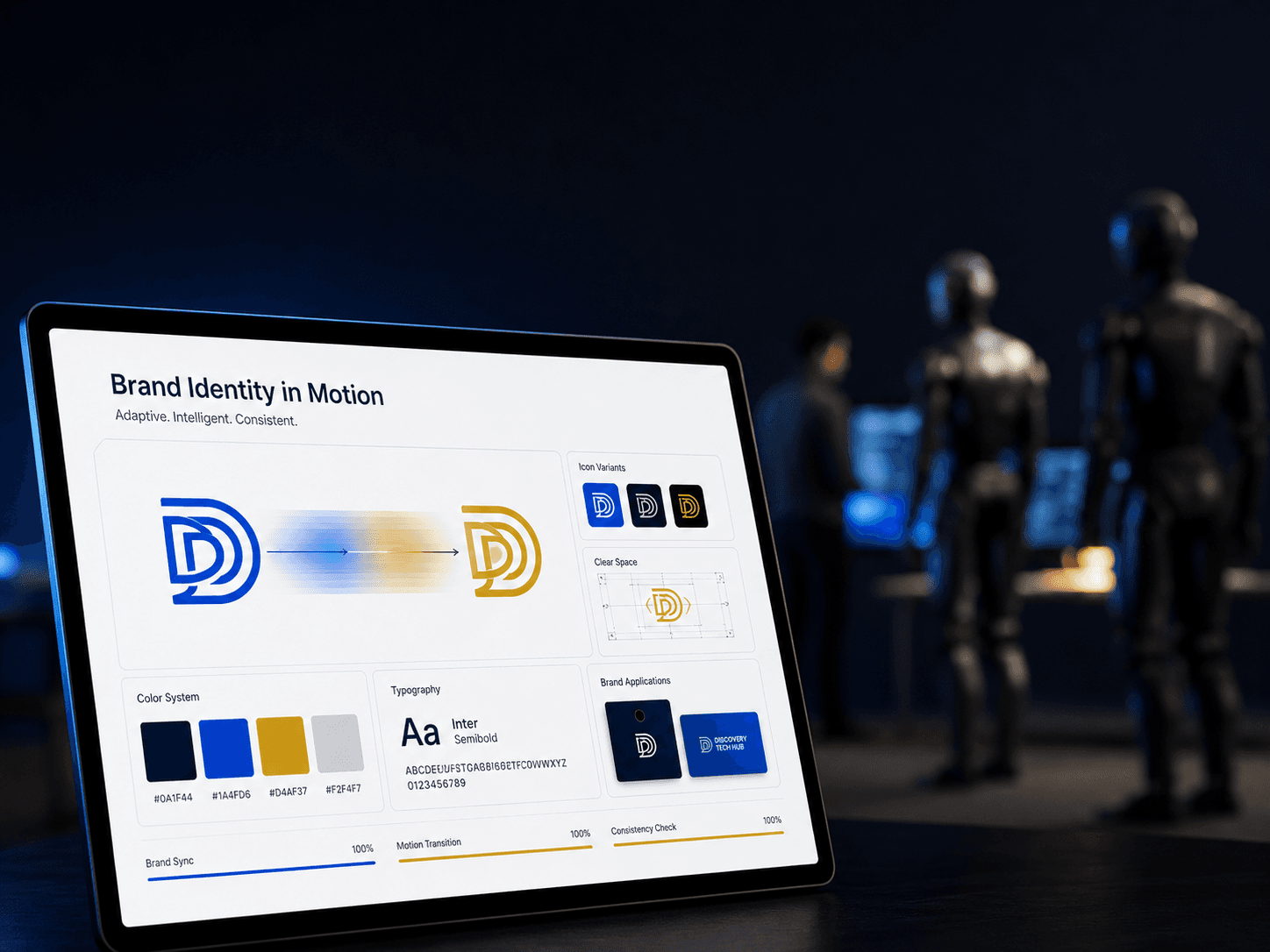
2. The adaptive layer (rule-based variation). This is where the "dynamic" part lives. Instead of one logo file, you define a small set of rules for how the core mark can flex: a simplified icon-only version for small spaces, a light and dark variant, a color-swap rule for different product lines or campaigns, and motion rules for how the logo animates on video versus stays static in print. Brands increasingly build genuine adaptive logo systems this way, where a mark changes color, texture, or form depending on the platform or audience segment it's appearing in, while staying built from the same underlying components.
3. The intelligence layer (listening and adjusting). This is the layer that makes it "AI-powered" rather than just "flexible." Tools now track sentiment and tone across social platforms and search, flagging when a brand's messaging is drifting from how it's actually being perceived, or when audience language is shifting (for example, moving from valuing "innovation" language toward valuing "authenticity" language). Nike is one of the more visible examples of this in practice, adjusting the tone of its brand voice by region, notably bolder and more assertive in North America, more fluid and expressive across Asia-Pacific markets, while keeping the same underlying brand promise intact.
4. The distribution layer (getting the right version to the right place). This is the practical, unglamorous layer: making sure the LinkedIn version of your post uses your professional tone pillar and your primary color, your Instagram Reel uses your motion-first logo treatment, and your email header uses your simplified icon. Increasingly, this layer is what companies mean when they talk about "dynamic brand guidelines" replacing static PDFs, since color schemes, typography, and asset choices are automatically adapted to different digital environments while a central set of rules keeps everything recognizably on-brand.
A concrete, illustrative example
Say you run a small consultancy with a blue-and-navy brand identity, an icon-based logo, and a personal LinkedIn presence in a different but related color scheme (green with gold accents, say). Here's how the four layers would actually work in practice:
- Identity core: Your logo mark stays exactly the same shape everywhere. Your anchor colors are locked: navy #0A1F44 and electric blue #1A4FD6 for the company, deep green with gold for the personal brand. Your voice pillars are fixed: credible, direct, forward-looking, never salesy.
- Adaptive layer: You build three logo variants (full color, single-color for dark backgrounds, icon-only for favicons and small spaces), two content templates per platform (a LinkedIn carousel template and an Instagram square template, both using the same color tokens but different layouts), and a rule that campaign graphics can introduce one accent color per quarter without touching the core palette.
- Intelligence layer: Once a month, you scan comments and engagement on your last 10–15 posts for tone, are people responding to the technical, credibility-driven posts more than the promotional ones, and adjust your next month's content mix accordingly instead of guessing.
- Distribution layer: A blog post automatically gets three outputs from one source: a long-form article (navy, professional tone), a LinkedIn carousel (navy plus one accent color, punchier headlines), and an Instagram graphic (a simplified, more visual version with less text), all generated from the same underlying template system rather than redesigned from scratch each time.
Nothing in that example requires a large team. It requires the templates and rules being built once, well, and then reused and lightly adapted going forward, which is exactly where AI tools now do the heavy lifting.
Where AI tools actually fit into this (practically)
This is the part people usually get wrong: AI tools don't replace the identity core, a human still needs to define the core mark, colors, and voice pillars once, thoughtfully. Where AI tools genuinely help is in the adaptive and distribution layers:
- Generating variations fast. Design platforms now use generative models to produce large numbers of logo, layout, or color-palette variations in minutes, so a creative team can review and refine rather than starting from a blank page every time a new format is needed.
- Producing platform-specific assets from one source. Tools like Canva's AI features, Adobe Firefly, and all-in-one suites such as CapCut now let a single piece of source content (a product photo, a concept sketch, a brand phrase) get turned into multiple branded formats, images, short video, motion graphics, without a separate production pipeline for each.
- Keeping voice consistent at scale. Tools like Jasper's brand voice features and Writer.com train on a brand's existing tone and structure, then help draft new content, captions, and email copy that stays recognizably "on voice" even when different people or platforms are producing it.
- Monitoring drift. Sentiment-tracking tools flag when messaging is sliding away from your intended tone, or when audience expectations are shifting, catching a problem while it's a small adjustment rather than a full rebrand six months later.
A step-by-step framework to start this quarter
You don't need an enterprise budget to build a working version of this. Here's a realistic path:
Audit what you actually have. Pull together every logo file, color code, template, and past post you've used in the last six months. Most businesses discover they already have three or four inconsistent versions of their own logo floating around before they even start.
Write down your identity core in one page. Your locked logo mark, two or three anchor colors with exact hex codes, your primary typeface, and three to five tone-of-voice words with one example sentence each. This becomes the one document nothing else is allowed to override.
Build a small adaptive rule set, not a huge one. Start with just three things: a dark-mode logo variant, one platform-specific template (say, LinkedIn), and one rule for how much color flexibility a campaign is allowed (for example, "one accent color per campaign, chosen from an approved secondary palette").
Pick one or two AI tools and learn them properly, rather than sampling five badly. A generative image tool for visuals (Firefly, Canva Magic Design, or similar) and a tone-trained writing tool for copy is enough to start. Depth with one tool beats shallow familiarity with five.
Set a simple listening habit. Once a month, read through comments and engagement on your last dozen posts and note, in plain language, what resonated and what didn't. You don't need enterprise sentiment software to start this, just discipline.
Keep a human approval step. Every dynamic system needs a point where a person checks that a generated variant still looks and sounds like the brand before it goes out. This is what actually prevents brand drift, not the AI tool itself.
Review and adjust quarterly. Revisit your one-page identity core every quarter, not to change it lightly, but to confirm it still holds and to fold in whatever you learned from the listening habit.
The pitfalls worth watching for
Dynamic branding has one real failure mode: mistaking flexibility for a lack of discipline. A few things to guard against:
- Letting every campaign introduce a new color or tone. If the adaptive layer isn't genuinely constrained by rules, the brand stops being recognizable within a year. Flexibility works only inside a fixed frame.
- Over-automating voice. AI-generated copy that isn't reviewed by someone who knows the brand tends to drift toward generic, safe phrasing. The tools are there to speed up drafting, not to replace judgment about what sounds right.
- Treating motion and adaptation as decoration rather than function. The point of an adaptive logo or template system is that it performs better in context (readable in a small space, legible in dark mode, punchy on mobile), not that it looks impressive in a portfolio.
- Skipping the audit step. Businesses that jump straight to building an adaptive system without first locking down their identity core usually end up automating inconsistency faster than they were producing it manually.
Finally
Dynamic branding isn't about making your logo move or chasing every design trend. It's about accepting that a brand now has to show up correctly across far more contexts, platforms, screen sizes, regions, moments, than one static file was ever built to handle, and building a rule-based system, aided by AI tools, that can do that without losing what makes the brand recognizable in the first place. Start with the one-page identity core. Everything dynamic gets built on top of that, never instead of it.